Create Web3 Dapp Components
Explanation for what Create Web3 Dapp Components are and how you can use them to build your dApp faster
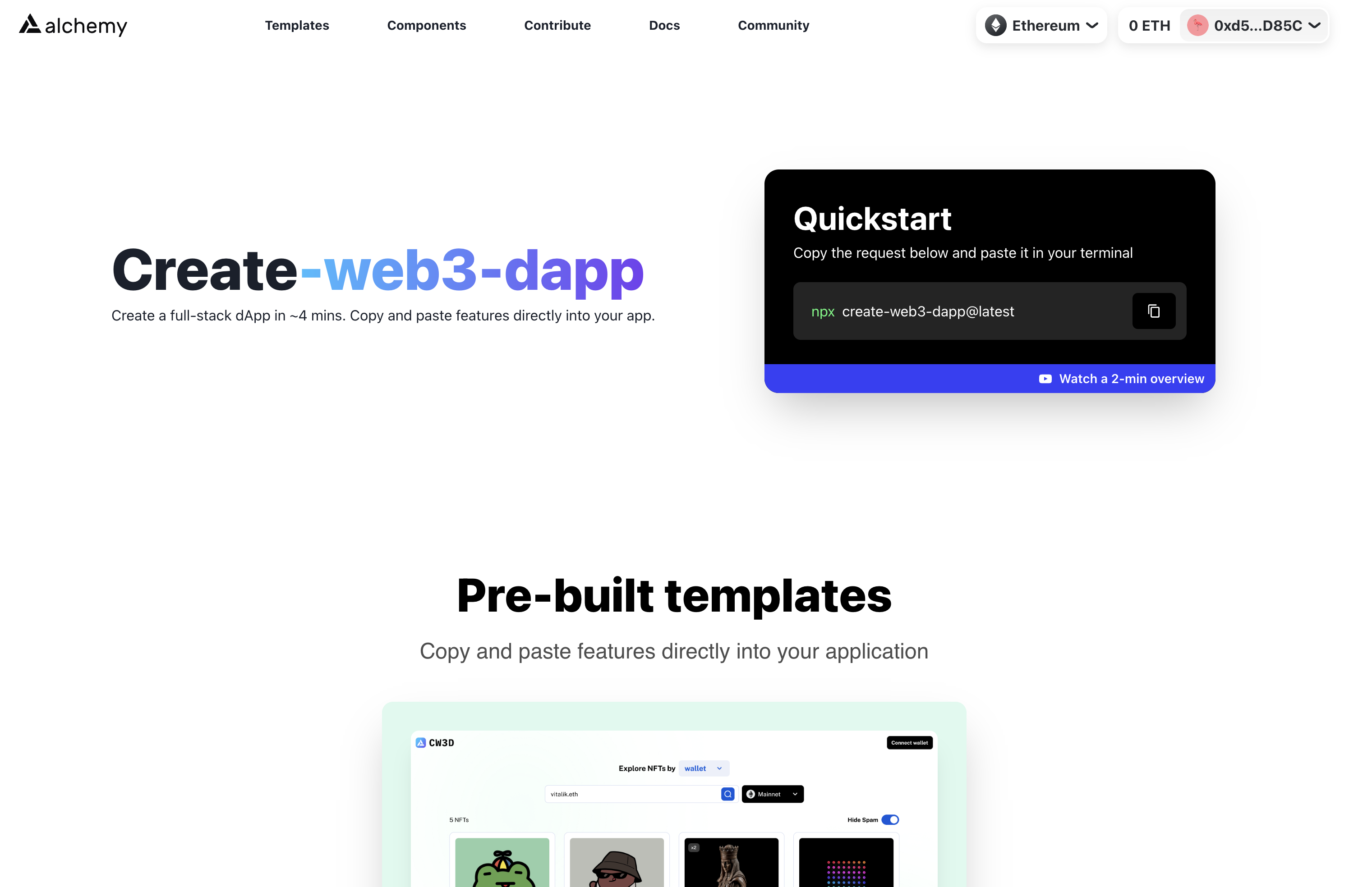
Create Web3 Dapp allows the developers to prototype their DApps in minutes using production-ready responsive React components. The components work best inside create-web3-dapp projects, but are compatible with any NextJS project.
To access the Components library, in your terminal inside your create-web3-dapp project folder, run:
npm run marketplace
or navigate to createweb3dapp.com:

On the website, navigate to templates and pick the component category you need. You'll be able to preview, test and copy the create-web3-dapp components using the components preview module. Let's see how it works.
How to use the components preview
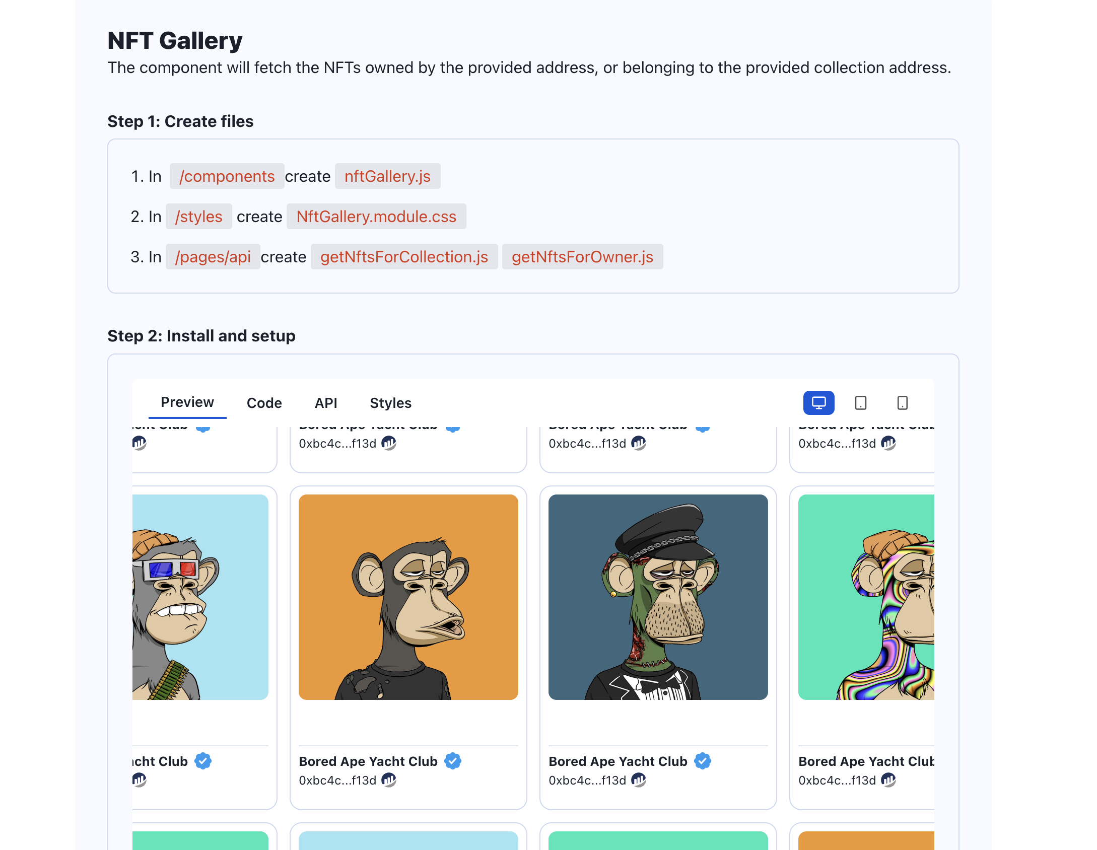
The components preview module allows you to preview, test, and copy any component on createweb3dapp.com.

Every component is broken down into 2 or 3 parts:
- The .jsx React component code
- The CSS stylesheet
- In some cases, also the code for the API to fetch the data used in the component itself.
On the top bar, you'll also be able to preview the component's resizing behaviours by clicking one of the 3 buttons:
- Desktop preview
- Tablet preview
- Mobile preview
On the bottom, you'll fine the extra library that are not included by default in the create-web3-dapp boilerplates. This is to keep the dependencies of the templates as lightweight as possible.
Now that you know how to navigate the components, implementing them will be quite simple, but let's deep dive into the Components Library documentation to learn how to implement every component.
Updated almost 2 years ago
